Basis risk in mortality projections
In a recent paper Stephen Richards and I discuss the effect of model choice on mortality forecasts. Our approach is quite low key: we look at just three models, all members of the Lee-Carter family. Nevertheless, our findings are quite dramatic: even within this very small family the differences in the forecasts really matter financially. So model choice matters.
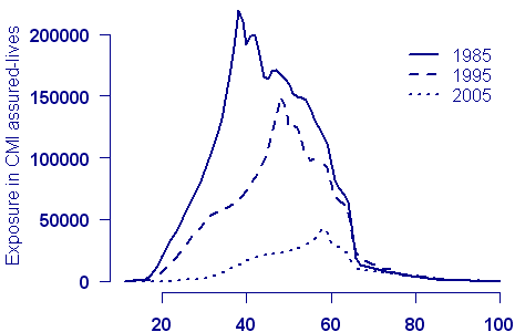
Other choices are important too. In our paper we were constantly up against the problem of what data to use for our forecast. Most of our illustrations use the Office of National Statistics (ONS) data set for England and Wales from 1961 to 2006 and ages 40 to 89. But there are (at least) two problems with this: first, the data set stops at age 89, and second, it is far from clear that the mortality of the ONS population is that of the select group of annuitants in which we are interested. Of course, that’s where the Continuous Mortality Investigation (CMI) should come in. The CMI does have data on assured lives and on pensioners. So why didn’t we use the CMI data? Unfortunately, the exposed to risk in the CMI data has fallen very sharply in recent years, and is, in any case, rather limited for post-retirement ages:
Figure 1. Exposure by age for CMI assured-lives data set at ten-year intervals
So we decided to use the ONS data to illustrate our method. But surely we can do better than this. The actuary can’t simply ignore the basis risk incurred in using the ONS data. Let’s think about this problem in one dimension first. Suppose we have some mortality data by age taken from the ONS data for the latest year available, and let ms(x) be its mortality table. We want to insure a set of lives with unknown mortality table m(x). The data on our lives suggest that we can find m(x) with log m(x) = log ms(x) + ax + b. A simple exercise in graduation will furnish estimates of a and b. Whimsically, I like to think of the table m(x) being “piggy-backed” on the table ms(x).
We want to extend this idea in one dimension:
(a) to cope with a mortality table in age and time, and
(b) to enable forecasting to take place.
In other words we have some large data set (possibly ONS population data or CMI assured-lives data); we will refer to this large data set as the baseline data. The baseline data set consists of two matrices, one of deaths (claims) and one of exposures, each with rows indexed by age of death (claim) and columns by year of death. We also have some of our own data for which we want both a graduation and a forecast. We denote by log ms(x, t) the graduation of the baseline data and by log m(x, t) the graduation of the data of interest. What properties would we like log ms(x, t) and log m(x, t) to have?
First, let’s think of our graduation (and forecast!) as a function of t. For any fixed age x, log ms(x, t) traces out a curve, Cx(t), in time t. We demand that the corresponding curve in log m(x, t) trace out a curve which is parallel to Cx(t); let’s denote the distance between these two parallel curves by d(x). Figure 2 shows this simple relationship where the distance between the red curve (baseline data, say) and the blue curve (our own data) is d(x) = −0.2 for x = 70:
Figure 2. Log mortality for males at age 70.
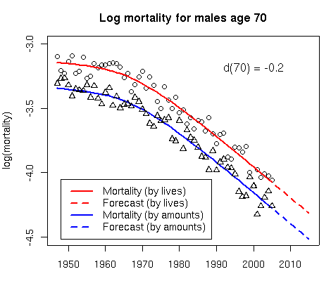
The parallel assumption is important, since it ensures that the forecast curves for our data are consistent with the corresponding curves for the baseline data. The dashed lines in Figure 2 show the consistent forecasts. We’ll come back to Figure 2 later.
And second, what about our graduation as a function of x? Let’s go back to the 1-dimensional formula log m(x) = log ms(x) + ax + b. We must choose a function to correspond to ax + b. A simple straight line is somewhat restrictive, so let’s allow a general smooth curve. A nice way to think of this is simply to say that the distances d(x) are smooth as a function of x. I like smoothing with the P-spline method of Eilers and Marx (1996) and I’ll assume that
d(x) = Σ Bj(x)θj
where {B1(x), . . . , Bc(x)} is a B-spline basis for age; smoothness is determined by a second-order penalty on the regression coefficients θj . For a fuller description of fitting smooth functions with P-splines see Richards, Kirkby and Currie (2006) and Richards and Currie (2009).
These two properties are sufficient to specify the relationship between ms(x, t) and m(x, t) and allow us to “piggy-back” the mortality of our own data set on the mortality of the baseline data set. We need two more things: a model for the baseline mortality (2-dimensional P-splines possibly) and the assumption that the deaths follow a Poisson distribution. Now we have a penalized generalized linear model and, with a bit of effort on the programming front, we are done.
One nice application of this method is to the joint modelling and forecasting of mortality data which are available not only by lives but also by amounts. Figure 2 shows such an application with a “piggy-back” model for mortality data by lives and amounts; see Currie, Durban and Eilers (2004) for an illustration of the method to CMI data. The method can be applied by insurers with their own, possibly limited, data. In Figure 2 the “red data” (ONS, CMI, HMD (Human Mortality Database)) is used to calibrate or “piggy-back” the “blue data”, the data set of interest. In this way we hope to obtain a forecast that eliminates at least some of the basis risk incurred when the forecast is based solely on the ONS data, for example.
To sum up: a “piggy-back” model allows us to forecast an entire mortality table when the data of interest do not support a forecast in their own right. It would be too much to hope that basis risk will be completely eliminated with this approach, but the model should take care of a substantial chunk of it. It would even be possible to extend this scheme to produce a family of consistent forecasts for various classes of business. Computationally, this can get quite ambitious, and the efficient array methods described in Currie, Durban and Eilers (2006) are best used here. But that’s another story.
Add new comment