Mortality transformation
A tool often used by demographers is the distribution of age at death in a population. This is known to actuaries as the curve of deaths, and the past 170 years have seen a rather remarkable transformation in this curve. In the mid-19th century mortality was characterised by a very high rate of mortality in the early years of life, as shown in the chart below using the third English Life Table for males:
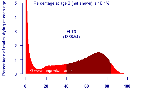
The dark band in the chart above shows the shortest adult age range in which half of all deaths occur. From the late 20th century onwards mortality looks very different, as shown below for English Life Table 15 for males:
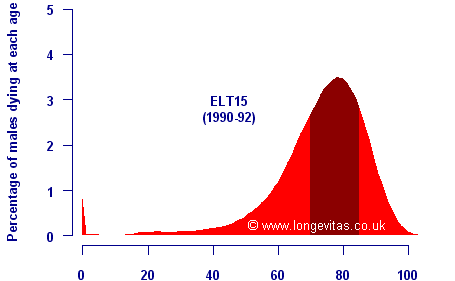
As before, the shortest age range covering half of all deaths is marked in a darker colour. There are several key differences between the two charts:
- Mortality is now almost exclusively a feature of old age, with deaths below age 40 massively reduced.
- The most common age at death (the modal age) has increased, as has the average age at death.
- The distribution of age at death is much more symmetric, with the tail to the left at younger ages much less pronounced as premature deaths are reduced.
- The age range with half of all deaths has also shrunk, a phenomenon known as mortality compression.
Studying these changes can give a good idea of what future mortality tables are likely to look like:
- The peak age at death is likely to increase.
- Mortality compression is likely to continue, shrinking the age range with half of all the deaths.
- The distribution is likely to become more symmetric, with fewer premature early deaths.
This offers two techniques to apply to projecting future improvements. The first is that the features above can be used to check the "sensibleness" of a given projection basis. Alternatively, the three features above can be projected themselves, and mortality improvements derived from the tables implied by the curve of deaths.
Add new comment