Playing with scales
Mortality rates increase exponentially with age. This can make comparisons difficult, as shown in Figure 1 below, which shows the period mortality rates for males in England and Wales at ten-year intervals. It is clear that mortality has fallen at older ages, but it is much less clear what is happening at younger ages.
Figure 1. Crude mortality hazard rates for males in England and Wales
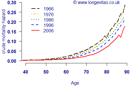
The vertical scale of any figure is determined by the extremes, which in mortality work means the rates at the youngest and oldest ages. The problem with Figure 1 is that the rates at age 90 are up to 300 times the rates at age 40, which means that even large relative changes at younger ages are invisible. The usual solution to this is to plot the logarithm of the rates, which removes the exponential rise in mortality and better enables the viewer to see what is happening at younger ages. Figure 2 shows the same mortality rates as Figure 1, but this time on a logarithmic scale. We can now clearly see that mortality has fallen at all ages, not just at older ages.
Figure 2. Log crude mortality hazard rates for males in England and Wales
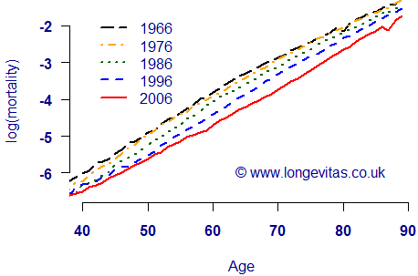
However, in one sense Figure 2 is still not revealing all the information it could. For example, exponentially rising mortality rates will always produce lines moving upward from left to right. This means the upper left and lower right areas of Figure 2 are always blank. While this gives a reliable place to put the legend, it does mean that the detail is packed into a fairly narrow band. Ideally we would make more use of the graph space, in much the same way as we used the logarithm to expand the scale on the lower left of Figure 1.
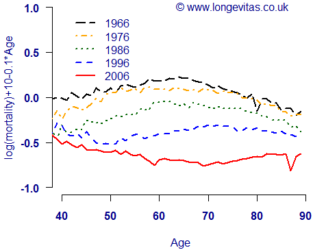
One approach is to use a linear adjustment, which simply means subtracting the values of a common straight line. This is done in Figure 3, which shows the same mortality rates as Figures 1 and 2, but this time it is the log mortality rate plus 10 minus one-tenth of the age. We can still see that there have been large reductions in mortality at all ages, but now we have two additional insights. First, it is now clear that the largest proportional changes have been between ages 60 and 70. Second, mortality improvements have accelerated over time, with the largest relative changes occurring in the most recent decade.
Figure 3. Linearly adjusted log crude mortality hazard rates for males in England and Wales
In summary, a careful choice of scale can reveal more information and yield better insights. Iain Currie used linear adjustment to reveal more detail about parameters in the Lee-Carter model in our recent paper on pricing longevity risk.
Comments
Can you explain the Coronavirus log mortality vs days since 25th death for the USA(as shown in NY times "Coronavirus deaths by US state and country over time: daily tracking")
It looks like USA was on the Japan and South Korea curve until about 60 deaths, then got on the same trend as Italy, France, Spain, UK.
What accounts for that anomaly?
Your assessment, or others who can explain, might be valuable to those in charge to ensure USA bends the curve ASAP. Thanks, Dave
Hi Dave, and sorry for our delayed response. Different countries have responded in different ways including in how incidence has been tracked and data gathered and reported. The early parts of pandemic mortality curves are likely the least reliable - volumes are small and reporting mechanisms are less well established. On bending the curve the only guaranteed tools we have at the present time are those around limiting contagion via hygiene and distancing. Our specific covid-19 blogs can be found here
Add new comment