Cause and effect
Examining past trends in cause of death can be very instructive. However, in some quarters it has become popular to try to extrapolate trends in causes of death to create a forecast of future mortality rates. This has a superficial appeal: using a more-detailed breakdown of mortality data feels like it should result in a better-quality forecast.
However, extrapolating trends is tricky because some important causes of death are driven by the same underlying factors. For example, smoking increases mortality due to heart disease and numerous cancers. This means that trends by cause of death are not independent, and forecasting correlated time series is problematic. Furthermore, some causes of death may be linked in little-understood ways, such as influenza and heart disease. CMI (2004) gives a good overview of some of the technical problems with cause-of-death forecasts, concluding that it is preferable to use all-cause mortality data. In their review report NSQR No. 8, the Government Actuary's Department (2001) provides a more detailed review, leading to the same conclusion.
Another stumbling block is that mortality rates by cause of death are strongly linked to socio-economic group. For example, Romeri, Baker and Griffiths (2006) showed the link between cause-of-death rates and deprivation index, and we reproduce some of their data in Figure 1.
Figure 1. Mortality rates by selected cause of death for males aged 15-64 in England & Wales
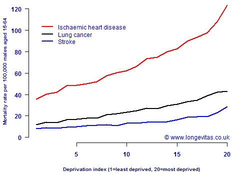
The implication of Figure 1 is that cause-of-death statistics need to be broken down by socio-economic group or deprivation index before being used for forecasting purposes. Failure to do this could give misleading results, since the various sections of society appear in cause-of-death statistics in different proportions to their presence in the population.
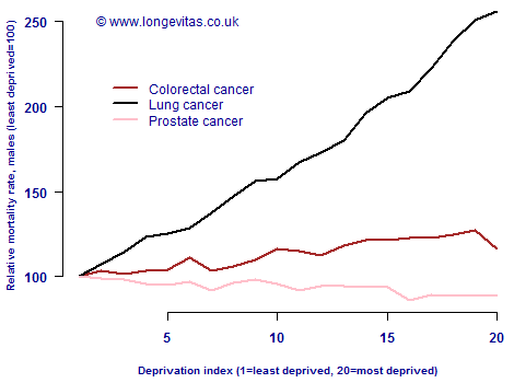
Figure 1 does at least raise the hope that cause-of-death differences by deprivation index might be similar across the various causes of death, i.e. that the rates might be in some kind of constant proportion. However, Figure 2 shows that this is not the case for the three most important cancers for males in England & Wales. Figure 1 shows that handling cause-of-death data by socio-economic group is necessary, but Figure 2 shows that the relationship is not simple.
Figure 2. Relative mortality rates by selected cause of death for males of all ages in England & Wales (least deprived=100)
There is a corollary to this and it is linked to concentration risk, i.e. the tendency for the least deprived members of society to have the biggest pensions and sums assured. Simply put, people with the largest liabilities in your portfolio have a different cause-of-death mix than the wider population.
Add new comment