Demography's dark matter: measuring cohort effects
My last blog generated quite a bit of interest so I thought I'd write again on cohorts. It's easy to (a) demonstrate the existence of a cohort effect and to (b) fit models with cohort terms, but not so easy to (c) interpret or forecast the fitted cohort coefficients. In this blog I'll fit the following three models:
| LC | \(\log \mu_{i,j} = \alpha_i + \beta_i \kappa_j\) |
| LCC | \(\log \mu_{i,j} = \alpha_i + \beta_i \kappa_j + \gamma_{j-i}\) |
| APC | \(\log \mu_{i,j} = \alpha_i + \kappa_j + \gamma_{j-i}\) |
where \(\mu_{i,j}\) is the force of mortality at age \(i\) in year \(j\). These are the Lee-Carter model (LC), the Lee-Carter model with an added cohort effect (LCC) (a special case of the Renshaw-Haberman model) and the Age-Period-Cohort model (APC). We need a set of constraints to fix unique estimates of the parameters which could potentially be used for forecasting in each of these models. We take:
| LC | \(\sum \kappa_j = 0, \sum \beta_i = n_a\) |
| LCC | \(\sum \kappa_j = 0, \sum \beta_i = n_a, \sum \gamma_c = 0\) |
| APC | \(\sum \kappa_j = 0, \sum_1^{n_c} \gamma_c = 0, \sum_1^{n_c} c \gamma_c = 0 \) |
where cohort \(c\) runs from 1 (youngest) to \(n_c\) (oldest). Notice that the constraint on the age parameters, \(\beta_i\), in LC and LCC has been chosen to ensure that the estimates of \(\kappa_j\) are consistent across all three models. We fit these models to Office for National Statistics (ONS) data on males for years 1961–2012 and ages 50–95:
Figure 1. Pearson residual plot for LC model.
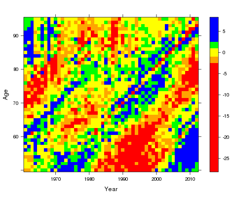
This plot (which R calls a levelplot) shows blocks of residuals; for example, yellow blocks indicate residuals between -1 and 1, while blue blocks indicate residuals more than 2.5. The presence of cohort effects is indicated by blocks of colour running from bottom left to upper right. The levelplots for the other two models are:
Figure 2: Pearson residual plot for LCC model.
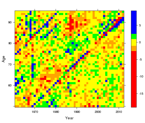
Figure 3: Pearson residual plot for APC model.
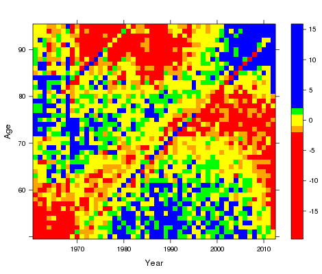
The inclusion of the cohort term in LCC and APC has much reduced the cohort pattern in the residuals. It is also worth noting that the amount of blue and red blocking is very much lower in the LCC model; ie, LCC fits much better than the other two models. As well as this graphical method of showing the presence of a cohort effect we can simply examine the deviance, R's preferred measure of overall fit, as shown in Table 1:
Table 1. Deviances and AIC values.
| Model | Deviance | AIC |
|---|---|---|
| LC | 17,057 | 17,341 |
| LCC | 7,202 | 7,678 |
| APC | 15,907 | 16,291 |
Table 1 shows that the APC model is a considerable improvement over the LC model, but that the LCC model is easily the best fitting (which confirms our observation on the levelplots). The following three plots compare the estimates of \(\alpha\), \(\kappa\) and \(\gamma\).
Figure 4: Plot of \(\hat \alpha\) in LC, LCC and APC.
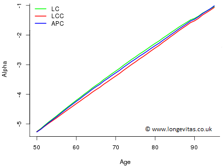
Figure 5: Plot of \(\hat \kappa\) in LC, LCC and APC.
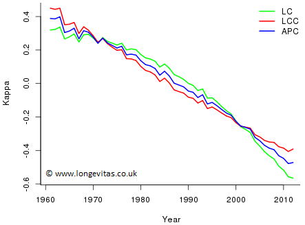
Figure 6: Plot of \(\hat \gamma\) in LCC and APC.
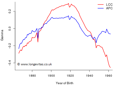
Figure 4 is not problematic - the estimates of \(\alpha\) are very similar across all three models. Figure 5 is more difficult. Reasonable forecasts of \(\kappa\) for LC and LCC would seem to point in very different directions (although this may be mitigated to some extent by the behaviour of the other parameters). Figure 6 also presents a problem: the estimated values of \(\gamma\) depend on which model is fitted in a startling way, i.e. the estimates can only be interpreted in the context of the model of which they are a part. In particular, we cannot say that one estimate rather than the other measures the cohort effect. Finally, forecasting each set of coefficients independently will clearly lead to very different forecast values. In other words, just as we can only interpret the fitted coefficients in the context of the whole model, so we can only forecast the fitted coefficients if we respect the whole model structure. This is a very tall order.
We end on a fanciful note. Cohort effects in mortality models are rather like dark matter for astrophysicists: calculations show their presence, but both effects prove very elusive when it comes to pinning them down.
Previous posts
Forecasting with cohorts for a mature closed portfolio
At a previous seminar I discussed forecasting with the age-period-cohort (APC) model:
$$ \log \mu_{i,j} = \alpha_i + \kappa_j + \gamma_{j-i}$$
Add new comment