Order, order!
Mortality improvements can be analysed in a number of ways. A common desire is to want to separate mortality improvements into components for period and cohort. However, this is much trickier than it seems, as we shall show here. In particular, the order in which calculations are performed can be very important.
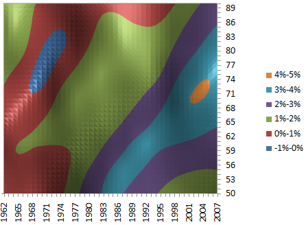
Figure 1 shows the mortality improvements derived from a two-dimensional smoothed model, identical to the ones presented by Richards, Kirkby and Currie (2006). The vast majority — 97.3% — of the improvements are positive, and there is a pronounced diagonal pattern reflecting the tendency for mortality improvements to track year of birth, or cohort. Indeed, the diagonal cohort patterns are more pronounced than any purely vertical period patterns, suggesting that any cohort component of improvements might be the dominant source. This echoes the results of Richards, Kirkby and Currie (2006).
Figure 1. Improvement heatmap for males in England & Wales. Source: Own calculations using smooth 2D age-period P-spline model applied to ONS data for males in England and Wales, 1961–2007.
One way some analysts begin is to calculate the column average improvement in Figure 1, i.e. to average the improvement rates over ages 50–90 for each calendar year. This is shown in Figure 2:
Figure 2. Column averages from Figure 1, i.e. average improvement over ages 50–90 for each calendar year.
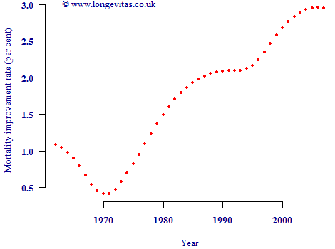
So far so good — Figure 2 shows the general acceleration in mortality improvements since 1970. However, at this point two crucial mistakes could be made. The first mistake would be to assume that the average improvement in each calendar year in Figure 2 is the same as the period component of improvement. The second mistake would be to assume that subtracting these average improvements by year will leave the cohort component of mortality improvement. Both assumptions are critically flawed.
The problem is that both cohort- and period-based improvements are caught up in the column averages in Figure 2. Rather than deduct the column averages first to yield "cohort" effects, one could equally calculate the average improvement rate by cohort and subtract this to leave "period" effects. This is done in Figure 3:
Figure 3. Column averages from Figure 1 after deducting average improvement for relevant birth cohort, i.e. average improvement over ages 50–90 for each calendar year after deducting average improvement for each year of birth.
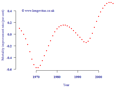
Figure 3 has a vaguely similar pattern to Figure 2, albeit with more exaggerated peaks and troughs. However, the vertical scale is very different. Instead of the bulk of mortality improvements being ascribed to "period" effects (as in Figure 2), now the bulk has been assigned to "cohort" effects. Due to the order of the calculations, the remaining column averages in Figure 3 now look much weaker than in Figure 2. Of course, it is equally invalid to call Figure 3 a graph of period effects as it is for Figure 2. Either graph may be used as a summary plot, but neither can be called a graph of period contributions to mortality improvements.
References:
Richards, S. J., Kirby, J. and Currie, I. D. (2006) The importance of year of birth in two-dimensional mortality data, British Actuarial Journal, 12 (I) No. 54, 5–61 (with discussion).
Add new comment