Getting animated about longevity
We'll be the first to admit that what we have here doesn't exactly provide Pixar levels of entertainment. However, with the release of v2.7.9 users of the Projections Toolkit can now generate animations of fitted past mortality curves and their extrapolation into the future. Such animations can help analysts understand the behaviour of a forecast, as well as being a particularly useful way of communicating with non-specialists. Below is a selection of animations from a smoothed Lee-Carter model fitted to the data for males in England & Wales between ages 50 and 104.
Figure 1 shows the logarithm of the force of mortality in the data region (1971–2015) and the forecast region. It shows how mortality is projected to fall at younger ages, but to hardly change at the oldest ages. The continuously expanding "funnel of doubt" in grey shows where the uncertainty lies in the forecast.
Figure 1. Development of log(mortality) with 95% confidence envelope.
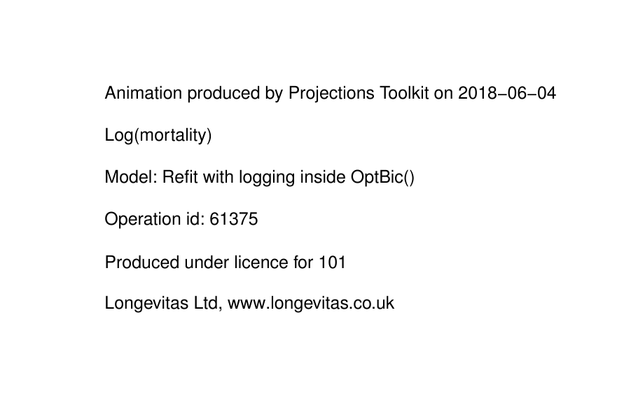
Figure 2 shows the ratio of the force of mortality in the data region and forecast region relative to mortality rates at the start in 1971. In addition to showing again how change is strongly age-related, we can see that the forecast improvements are in fact modest and not as dramatic as what were observed in the past.
Figure 2. Development of mortality relative to 1971 with optional "trail" showing past history.
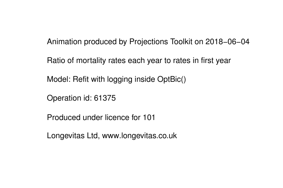
Figure 3 shows the phenomenon of the "rectangularisation" of the survival curve.
Figure 3. Development of tp50tp50 with optional "trail" showing past history.
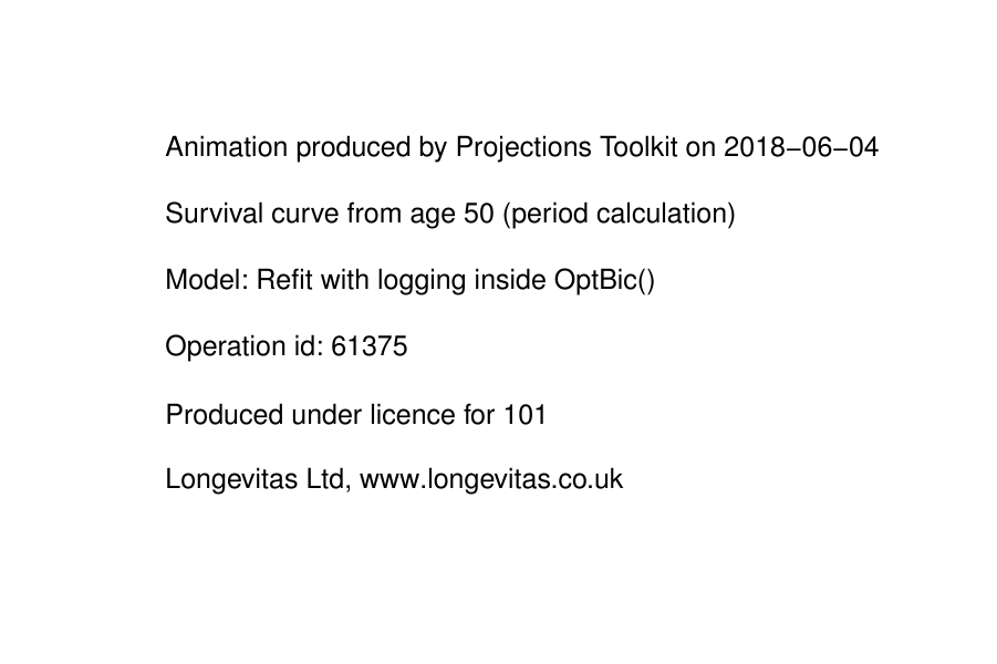
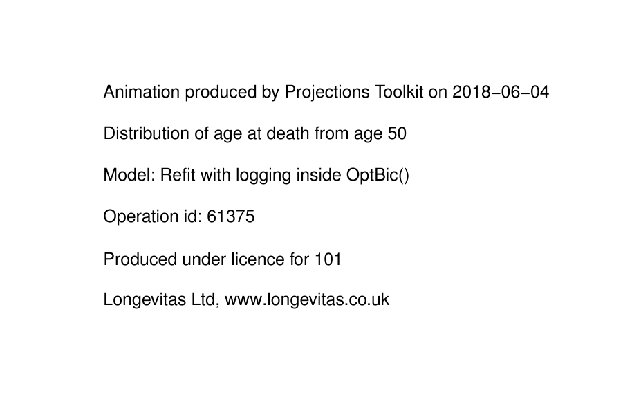
Figure 4 shows the distribution of the age at death. In addition to the modal age at death increasing, the plot becomes more leptokurtic (more "peaked") as premature early deaths reduce and more lives reach old age. The spread of the distribution around the modal age reduces, a phenomenon known as mortality compression.
Figure 4. Development of curve of deaths, i.e. the distribution of the age at death.
Animation with the Projections Toolkit
Animations like those on the left can be generated from any Toolkit model by clicking on the ![]() icon. Users can generate animations either as GIF files, say for putting into PowerPoint presentations, or else as PDF files. Animations can be generated for any model, including models fitted before the release of v2.7.9.
icon. Users can generate animations either as GIF files, say for putting into PowerPoint presentations, or else as PDF files. Animations can be generated for any model, including models fitted before the release of v2.7.9.
Add new comment