Changing patterns of mortality
In an earlier post we introduced the idea of the so-called curve of deaths, which is simply the distribution of age at death. This is intimately bound up with survival models and the idea of future lifetime as a random variable.
The development of the distribution of deaths by age can reveal a lot about a population. Animation 1 shows the development of the distribution of deaths for males in England and Wales since 1961. It shows the very welcome fall in infant mortality on the left, but it also shows the steady rightward drift in the distribution at older ages.
Animation 1. Male deaths by age in England and Wales since 1961. Click on the chart to restart the animation.
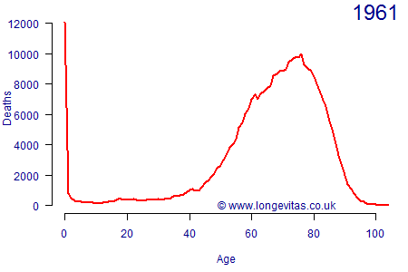
Animation 1 shows how the modal age at death drifts steadily rightwards over time, but it also shows another feature — a spike to the left of the mode that becomes evident from the 1970s onward and grows in size. This is not due to some strange cohort-mortality effect. Instead, this is the generation born in 1919–1920 after the end of the First World War, which was much larger than the generation before it, as shown in Figure 1.
Figure 1. Births by quarter in England & Wales. Source: ONS data, graph after Richards (2008).
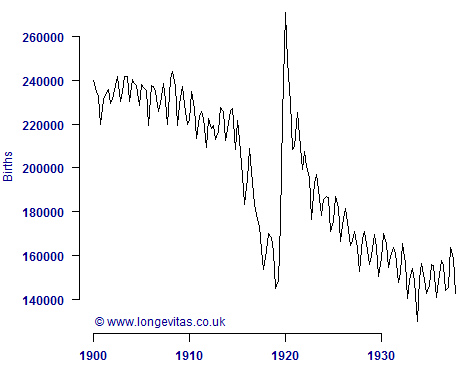
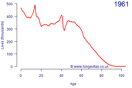
The sharp swings in births in Figure 2 make it tricky to estimate the population exposed-to-risk in a given year, which leads to some odd patterns in the data for the 1919 generation. Indeed, Cairns et al (2015) came to the conclusion that the population estimates for the 1919 generation were not consistent over time. The 1919 generation is not the only anomaly — Animation 2 shows that, by 2015, one can see that yet another population spike exists just before age 70. This is the generation born immediately after the end of the Second World War. In the case of both population spikes, these are caused by demobbed soldiers returning to civilian life and starting — or continuing — their families. While this is good news for almost everybody concerned, it does make it hard to estimate the population exposed-to-risk at a given age in a given year.
Animation 2. Male mid-year population estimates by age in England and Wales since 1961. Click on the image to restart the animation. Note that the post-2001 population estimates are the ones revised after the 2011 census.
References:
Cairns, A. J. G., Blake, D., Dowd, K. and Kessler, A. R. (2016) Phantoms Never Die: Living with Unreliable Population Data, Journal of the Royal Statistical Society, Series A (to appear).
Richards, S. J. (2008) Detecting year-of-birth mortality patterns with limited data, Journal of the Royal Statistical Society, Series A, 171 (1), 279–298.
Comments
Interesting-sounding animations are broken. Chrome 79 / Windows 7 Pro.
We're finding everything works in Chrome, although our browser versions are slightly later than yours. Once the animations end, they stop on the final image - if you click on the image they will restart. Hopefully this resolves things.
Add new comment